Thoughts
In today’s digital age, businesses are constantly vying for the attention of potential customers. With so much information available online, how do you make sure your message stands out? Many businesses struggle with low conversion rates because they fail to create a focused and compelling user experience. This can lead to lost sales and wasted marketing efforts.
The solution to this problem can often be simple: designing a one page website. No longer are expensive, content-heavy websites the obvious answer. Instead, one page websites, also known as single page sites, offer a cost-effective and efficient way to capture leads and drive conversions.
One-page websites are not like traditional websites in that they have all the content and calls-to-action on a single page. By making the customer journey simpler and guiding visitors towards a specific action, it reduces costs and enhances overall user experience.
One-page websites are very popular, especially for small businesses, events, products, startups, and personal portfolios. Those that have a strong core offering and end up choosing one page website templates can benefit from higher engagement and conversion as a result.
In this article, we will explain the difference between a one page website vs multiple pages, as well as show you how to create a one-page website that gets results using examples from our relevant projects SUSS and Bunker House.
What is a One Page Website?
A one page website is a web design approach that uses one HTML page to display all the content. The navigation links scroll down or across to different sections rather than loading new pages. Single page websites are ideal for highlighting various aspects of your business without requiring a lot of content, which is the opposite theory of multi-page websites.
Do One Page Websites Work?
Yes, this type of website is highly effective when designed and utilised correctly. They work by removing distractions and therefore are very easy to navigate. According to industry research, businesses that use one page websites see a significant improvement in their conversion rates.
What's the Difference Between a Landing Page and a One Page Website?
A landing page is a web page created for a specific marketing campaign or offer - ideal for promoting a specific product, service, or event. Landing pages are often designed with a single goal in mind, like signing up for a newsletter or making a purchase. With landing pages for example, it’s common to remove the navigation menu in favour of sign up forms and/or specific contact information. A one page website on the other hand is a complete website in one page, and therefore would include different sections about a business or product.
Do One Page Websites Rank?
Absolutely, one page websites have the potential to achieve high rankings in search engines. By ensuring your website is well-organised, contains precise and relevant content, includes quality links and uses correctly optimised images, you can enhance its visibility significantly. However, when considering SEO for a one page website, it's crucial to align your design with your specific goals and content needs to maximise effectiveness.
How do I Structure a One Page Website?
Step 1: Define Your Goal
The first step in designing a high-converting one page website is to define your goal. What action do you want visitors to take? This could be signing up for a newsletter, downloading an eBook, making a purchase, or scheduling a consultation. Your goal will shape the entire design and content of your one page website.
Step 2: Choose the Right Platform
Choosing the right platform is crucial for the success of your one page website. Here are some popular website builder options:
-
Canva: easy to use and great for making attractive one page websites fast. It has many templates to make a professional website without needing advanced technical skills.
-
Webflow: a flexible and powerful platform, perfect for those who want more control over their design and functionality. It allows you to create custom animations, interactions, and complex layouts.
-
Squarespace: has a range of beautiful templates and an easy-to-use interface. It's perfect for those who want a balance between design flexibility and ease of use. It also offers excellent support and built-in SEO features.
-
WordPress: one of the most popular platforms for building websites. With its extensive library of themes and plugins, when creating a one page website with Wordpress, you’ll benefit from a wide range of options.
When it comes to building a one page website, several platforms offer unique benefits. Canva is perfect for those who want a quick, visually appealing site with minimal technical effort. Squarespace provides simple, elegant templates and an easy-to-use interface. WordPress stands out with its extensive customisation options and a vast library of themes and plugins.
However, for simple websites we choose Webflow as the preferred option every time. Webflow gives you precise control over design and functionality without the need for servers and hosting. It's great for both designers and developers, offering the best of both worlds without sacrificing creativity or performance.
Step 3: Craft a Compelling Headline
Your headline is the first thing visitors will see, so it needs to grab their attention and convey the value of your offer. Keep it clear, concise, and compelling. For example, SUSS uses the headline “Experience Next-Level Comfort” to immediately communicate the benefits of their products.
Step 4: Use Engaging Visuals
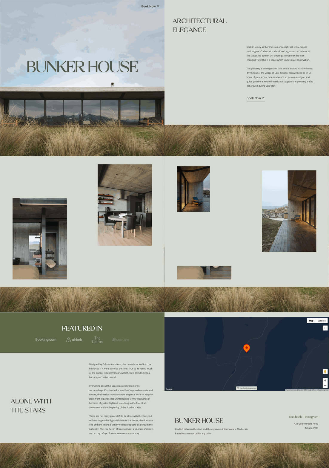
High-quality images and videos can significantly enhance the appeal of your one page website. They help to illustrate your offer and make your page more engaging. Bunker House, for instance, uses stunning visuals of their property to attract potential guests.
Step 5: Write Persuasive Copy
Your copy should be focused on the benefits of your offer and how it solves the visitor’s problem. Use bullet points, short paragraphs, and clear language to keep it readable. Highlight key features and benefits that will persuade visitors to take action.
Step 6: Include a Strong Call-to-Action (CTA)
A strong CTA is crucial for conversions. It should be clear, compelling, and easy to find. Use action-oriented language and make sure it stands out on the page. For example, SUSS has a prominent “Shop Now” button that encourages visitors to make a purchase.
Step 7: Build Trust with Social Proof
Including reviews and case studies can help build trust and credibility. Showcasing positive experiences from previous customers can reassure visitors and increase their likelihood of converting. Bunker House highlights guest reviews to demonstrate the quality of their offering.
Step 8: Optimise for Mobile
With more people browsing on their mobile devices, it’s essential to ensure your one page website is mobile-friendly. This means using responsive design so that your page looks great and functions well on all screen sizes.
Step 9: Ensure Fast Load Times
One page websites should load quickly to keep visitors engaged. Optimise images, use efficient coding practices, and leverage browser caching to ensure fast load times.
Step 10: Test and Optimise
Finally, test and optimise your one page website to improve its performance. Use A/B testing to experiment with different headlines, images, copy, and CTAs. Analyse the results and make data-driven decisions to enhance your conversion rates.
High-Converting One Page Website Examples
SUSS
SUSS is a New Zealand-based company that offers learning design experiences for its clients. This one page website is a great example of modern, engaging layout, designed by our friends at Smith & Peach. Built using Webflow, it features a compelling typography, a vibrant colour palette and strong CTA’s.

Bunker House
Bunker House is a boutique accommodation offering located in Tekapo, New Zealand. This one page website we designed and also built using Webflow. Given the stunning visuals of their property shot by Mickey Ross, we took a minimalist design approach to let it sell property. With a lite, earthy colour palette combined with a balanced scroll effect that includes subtle animations, this one page site has all the goods to give its audience a pleasurable experience.

The main takeaway with these examples is that if you want to create a single page website that converts, it will involve careful planning and attention to detail. In summary, here are the steps you'll want to take for creating your own high-converting one page website:
-
Define your goal
-
Choose the right platform
-
Craft compelling headlines
-
Use engaging visuals
-
Write persuasive copy
-
Include strong CTAs,
-
Build trust with social proof,
-
Optimise for mobile
-
Ensure fast load times
-
Test and optimise moving forward
By following these steps and using best practices, you can create effective one-page websites. These websites will attract visitors and turn them into loyal customers. If you think a one page website might be ideal for your business, don’t hesitate to get in touch for a chat.


